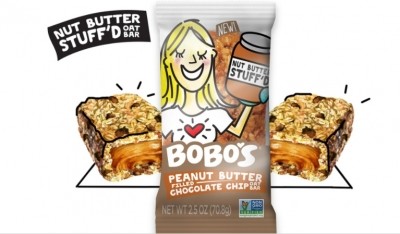
Typography of name confuses consumers
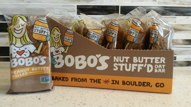
The font and color of the product name on the front of the package also caused confusion by some testers. Bonhomme said the white text on a tan background was “very hard to read,” and another male reviewer said the positioning of the product name Bobo’s under the woman’s chest made him initially transpose the letters and misread the name – an admission that caused him to blush.