Mamma Chia rebrands to pop off shelf with natural, iconic, inclusive look
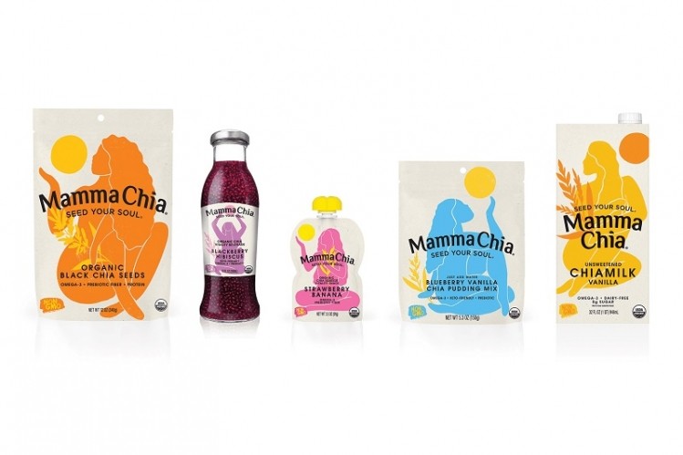
Gestalt Brand Lab developed the complete makeover that includes an icon refresh, updated color palette and new packaging across seed, beverage and squeeze pouch lines.
"For years, Mamma Chia has been one of the best functional products on the market with real benefits, but their branding and packaging wasn’t living up to the purposeful and intentional heartbeat of the company,” said Brian Munce, managing director at Gestalt Brand Lab.
Time for a brand revolution
Mamma Chia brought the first chia beverage to market in 2009, sharing the “magic of chia” and its superfood benefits. As the company continued to expand product offerings and sustain double-digit growth, Founder and CEO Janie Hoffman felt like it was “time for a brand revolution”.
“In terms of aesthetic, this is a dramatic shift for our brand, but it’s a shift that better reflects our core values,” she said.
“We believe there’s a place for everyone at the Mamma Chia table, and this rebrand has us feeling energized and revitalized for the journey ahead.”
According to Food Market Insights, the chia seed market is poised to grow at a CAGR of 6.8 percent through 2031 and the global functional foods and the natural health products market at 5.3 percent through 2029. Brands increasingly are looking for ways to set themselves apart from the competition.
A less is more approach
"We took the approach of 'less is more' with this project and as a result the Mamma Chia product truly stands out from all others on the market with goddesses that are empowering and uplifting," said Chad Farmer, creative director at Gestalt Brand. This is achieved through “more iconic designs and brighter pops of color”.
Keeping Mamma Chia’s “Seed Your Soul” tagline, Gestalt gave the goddess icon a more full-figured and natural look to embrace “inclusivity, diversity, body positivity, empowerment and joy”. She is printed in an array of cut-out colors matched to the brand’s different products and fruit flavors.
“Hand-done illustration was one very intentional tactic that we implemented with Mamma Chia to help convey natural without being overly explicit or falling into the sea of sameness on the shelf,” Farmer explained.
Product packaging was simplified and focused on core prebiotic, keto-friendly, immunity and vitality messaging instead of over-emphasizing ingredients. For its Chiamilk, Mamma Chia traded out its plastic bottle for shelf-stable carton in response to demand for storable products that may be purchased online.
Updated packaging will appear on store shelves starting next month and roll out throughout the first half of the year.