“One: Is it visible? Does it stand out from the competition and have stopping power?
“Two: Is it visceral? Does it create a positive emotional reaction with consumers resulting in strong preference?
“Three: Does it pass the memory sketch test… Can you quickly describe it to someone seeking it out in a store? ‘It’s the one with the…’”
Is it pretty wallpaper, or branding?
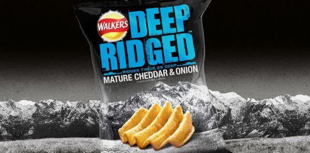
And if it’s not all of these three things, says Thorneycroft, founder of brand packaging design agency Perspective Branding (which has worked with brands from Doritos and Lay’s to Mike’s Hard Lemonade), “You don’t have a brand.”
He adds: “What we’re seeing a lot more of now in the food and beverage industry is what I would describe as packaging, or fancy wrapping paper, rather than branding. There’s no real story there, no real brand essence or equity being built, no narrative, no strategy.
“It’s just pretty, in fact some of it’s quite beautiful. But if you’re selling a protein bar or a beverage with no marketing or advertising budget, the role of the packaging is absolutely critical if you’re trying to build a legitimate brand that’s going to stand the test of time. It can’t just be pretty.”
He adds: “It worries me that some of these great products are being tricked into thinking that good-looking design is really branding, but it’s not. It’s the same with advertising. Maybe there’s a really funny ad you see on TV, but the next day, you say, I saw this really funny ad yesterday... what was the brand again?”
This doesn’t mean brands should ditch humor or beautiful artwork in favor of purely utilitarian ads with annoying, but memorable, jingles or strap lines, or always feature a picture of the product on the front, he says.
It’s just that it’s important not to forget what you’re trying to achieve, he says: “At the end of the day, it’s about selling products.”
At the end of the day, it’s about selling products
Moreover, it might seem obvious, but when you’re going to put something in your mouth, it also helps if the packaging clearly conveys what the product is, he observes.
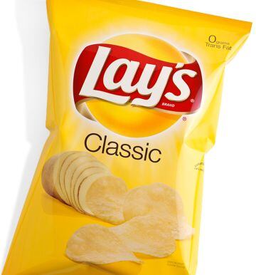
“When we first did the Lay’s re-brand we created the sun with the red ribbon for the brand, and created the image of a potato becoming chips, showing that the chips come from potatoes. It tells you what the product is, and it’s really simple.
“I think the current design hasn’t changed since 2006, and that’s something I’m really proud of because it proves that the design has stood the test of time. All brands need tweaks from time to time, but if you have to constantly go back and completely change your branding, something’s not right.”
Fun and color
As for trends within food packaging design, one noticeable trend is that natural, organic and 'healthy' brands have recognized that they need cleaner, brighter, more accessible packaging to appeal to a broader, more mainstream audience (‘all-natural’ doesn’t have to mean green and brown anymore), he says.
They are also injecting fun back into healthy or better for you products via packaging design, he observes. “It’s OK to celebrate great taste'; and fun doesn’t have to mean bad for you. Design can be more light-hearted. That means colors, characters, and so on.”

Hippeas: The happy yellow color and smile graphic has an instant visceral reaction
A great example of this is Hippeas, which is selling a product that could potentially be regarded as niche (organic chickpea puffs), but is appealing to a broad demographic and building a brand, not just a product, he says.
“It’s visible. This brand has bright, bold, striking graphics that would definitely pop in just about any occasion. Any potential barriers to entry (do I like chickpea puffs?) are offset by brand character … which I think is the way forward.
“It’s visceral. The happy yellow color and smile graphic has an instant visceral reaction. It’s hard not to have the corners of your mouth turn up and enjoy the packaging. Packaging should make you feel good about your purchase, I think this does exactly that.”
“Finally, it’s memorable. The bright yellow pack with the smile is simple to remember and could easily be identified. We must also give credit to the wonderful name. It too is charming and helps create a real sense of the brand personality and whether consumers would want to be part of its movement. If only more brands were like this!”
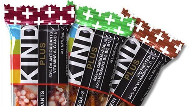
KIND is another brand Thorneycroft admires for standing out in an increasingly crowded nutrition/snack bar market “because it stands for something.”
"Is it visible? Does it stand out from the competition and have stopping power?
Is it visceral? Does it create a positive emotional reaction with consumers resulting in strong preference?
Is it memorable? Can you quickly describe it to someone seeking it out in a store? ‘It’s the one with the…’”
Simon Thorneycroft, founder & CEO, Perspective Branding
Black packaging can disappear on shelf
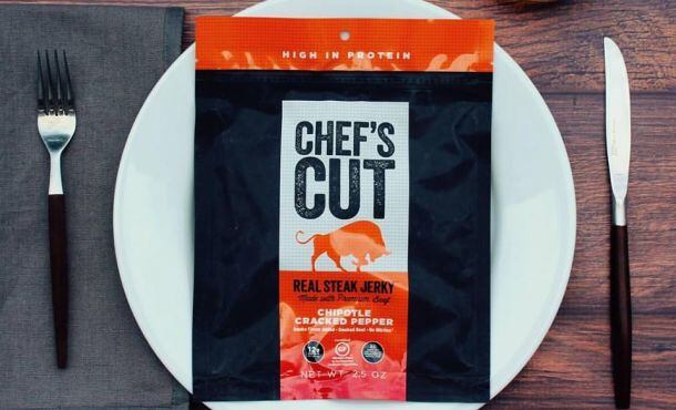
Other fast-growing snack brands, however, have been a hit in spite of, rather than because of their packaging,he argues, highlighting the highly successful Chef’s Cut jerky brand.
“Black packaging often actually disappears at shelf as the environment is typically far darker than designers ever think of. Sure it pops on a white piece of paper … but when does the shelf look like that?”
The design also lacks character, he contends. “The language is straightforward and honest, but lacking in personality. It just is functional in its approach and leaves me with no emotional attachment,” while the “name sounds like a store brand.”

Food & beverage packaging has to work across multiple platforms
Finally, one thing companies increasingly need to bear in mind when working on a branding strategy is how the brand will work across multiple retail and marketing platforms, he adds.
So the packaging has got to pop out on the shelf in a traditional supermarket, but it’s also got to stand out on the virtual shelves at Amazon, Thrive Market, or DirectEats, as well as on social media platforms, and on the company website, and on desktop and mobile applications.
“The first time you see a brand these days may well be online, so how do you design packaging that works in a digital environment but also pays off when it’s in your hand?”