Lay’s “enters a new era” with a brand and packaging refresh designed to reach snackers worldwide that spotlights quality, ingredient origin and agricultural partnerships.
The refresh is driven by evolving consumer preferences and a curiosity for “what’s behind their favorite foods,” explained Alexis Porter, VP, Lay’s Global Food Groups.
“We’ve always had real potatoes and real flavors and real joy in our products, but we’re now telling that story front and center” on packaging and digital platforms globally, she said.
“Lay’s is entering a new era, and it is the biggest global brand refresh in nearly our 100-year history. This new look puts a bold spotlight on our farm grown potatoes and quality ingredients,” she added.
What’s new?
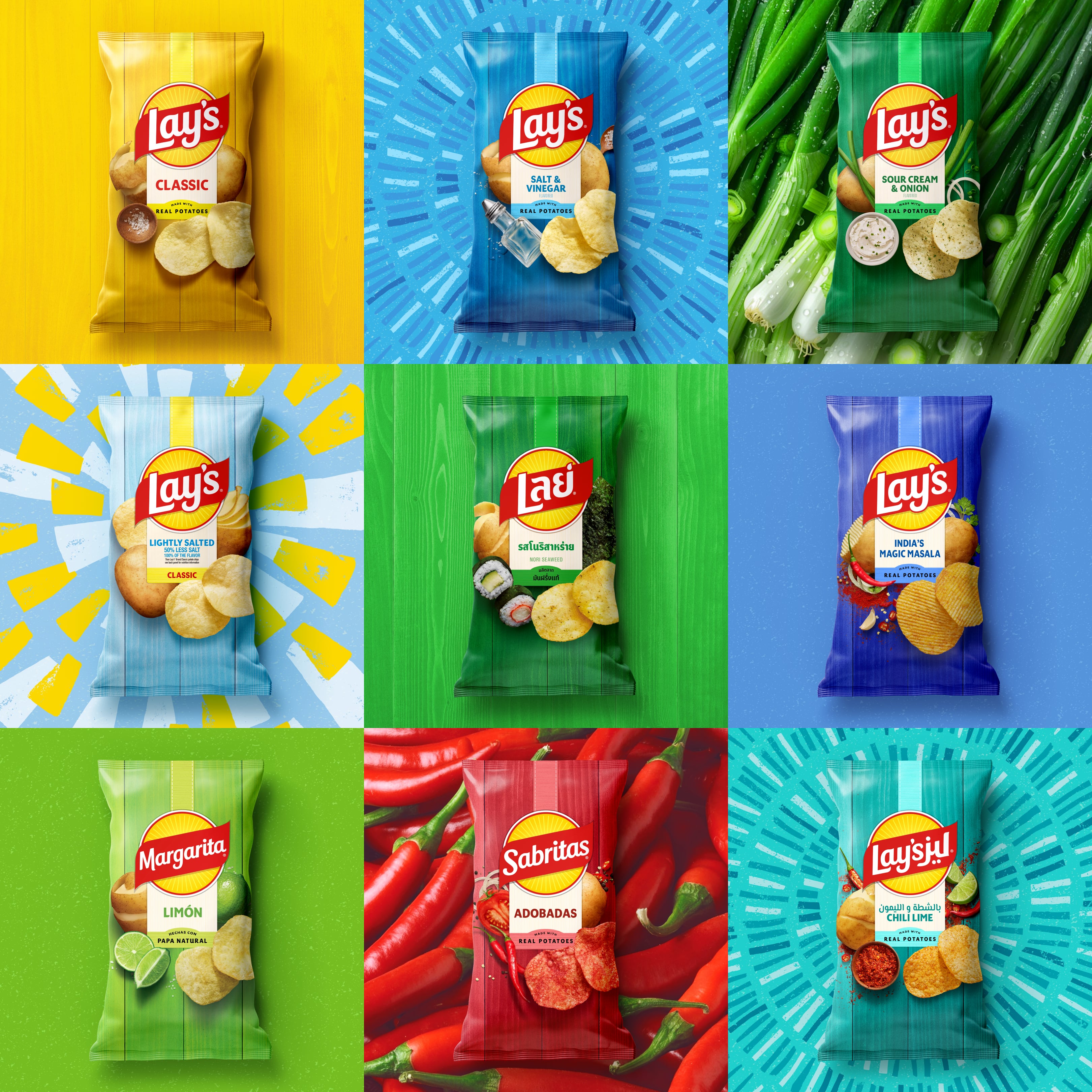
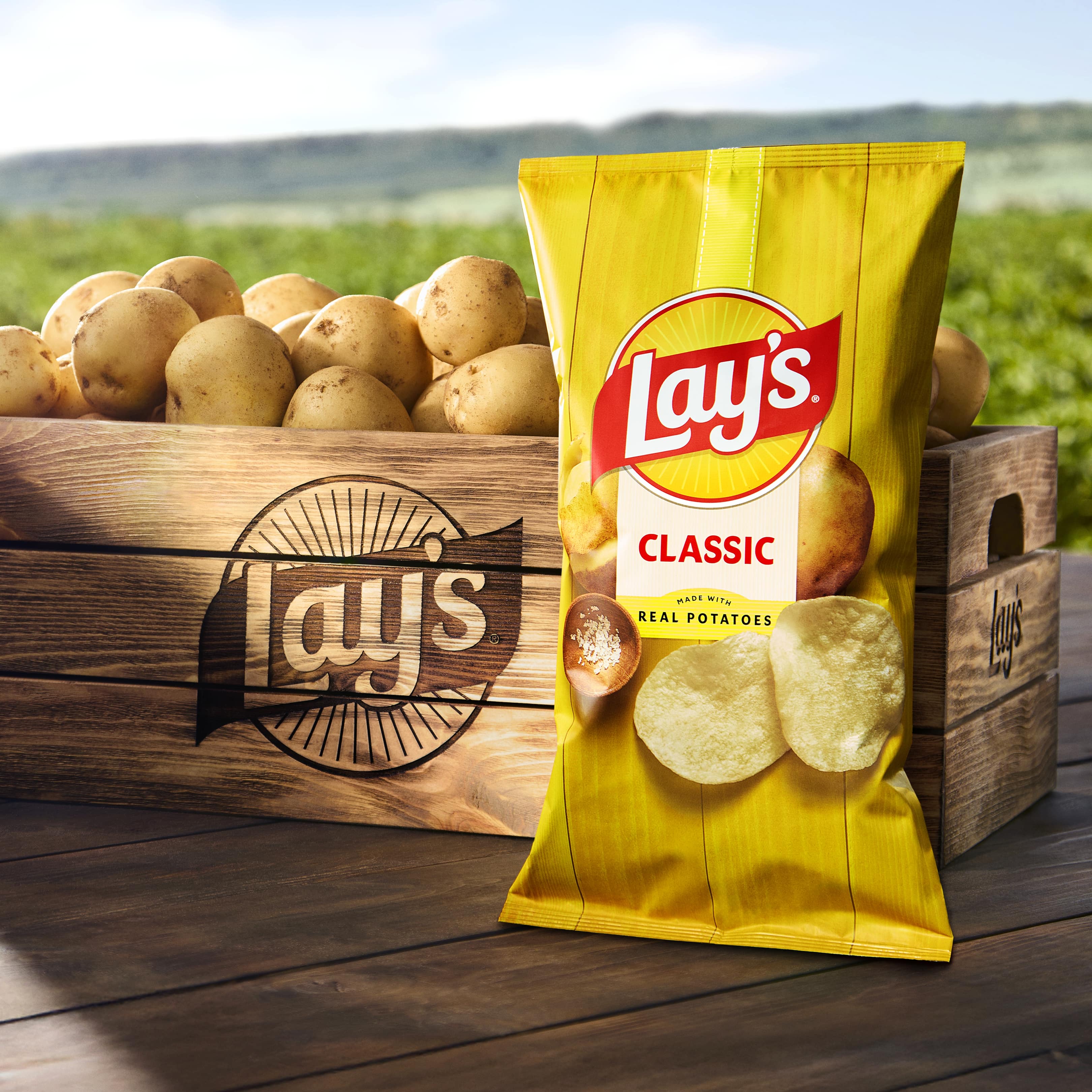
The brand’s visual story continues to center around the “humble potato” which is prominently displayed on the front of every bag of Lay’s chips alongside the iconic Lay’s sun and ribbon, Porter elaborated.
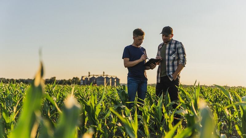
The potato and chip imagery on the front of every bag was inspired by consumers’ interest in ingredient origin. The image also reflects Lay’s global partnerships with more than 300,000 farmers in 60 countries that produce 45 billion potatoes annually for its potato chip varieties and recipes, Porter explained.
“We really put the focus on closeups of the potato, the potato chips, making sure that was really clear that that’s the heart of our brand, and we celebrate that in an energetic, cool visual style that harnesses the power of the sun,” she added.
While the Lay’s sun and ribbon were existing elements in the logo, the updated design “takes the elements that consumers have loved and kind of amplifies them,” including adding sun rays to emphasize the “sun’s energy” that helps grow the potatoes, she said.
With the core imagery – the potato, sun and ribbon – in place, Lay’s also highlights local flavors from each market on the front of packaging to ensure familiarity and relevancy with those consumers, Porter said.
“One of the things that consumers want to be able to do is find the flavors that they love really clearly” through colors and flavor callouts in the center of the package for easy searching in store, she added.
Removing artificial colors and flavors in the US market first
As CPG brands move to reformulate their products in line with recent regulatory pushes to remove artificial dyes and flavors, this shift is “not new” for Lay’s as the company already has phased out some of these ingredients, Porter said.
The brand will transition to natural alternatives as part of an industry-wide initiative, supported by new guidelines from FDA, as announced by parent company PepsiCo.

All of Lay’s core products in the US will no longer contain artificial colors or flavors by the end of 2025 and the change will be communicated on pack, Porter said.
The brand’s cleaner label initiatives also revolve around other ingredients. For example, Lay’s kettle-cooked and baked ingredients will replace some of its seed oils like corn, canola and soy with avocado and olive oils. Some of these replacements also are determined by what’s available locally, Porter added.
“If we have the ingredients there, the local teams will call out any messaging on claims or ingredients, really putting taste at the forefront and making sure we’re meeting the local consumer tastes and needs,” she explained.
Challenges in implementing a consistent, unified brand identity globally
Developing a unified brand identity globally comes with its own set of challenges, and while Lay’s launched several refreshes, it did not have nearly as many flavors and lines on a global scale, Porter said.
For a refresh of this size, the brand first recognized its core elements – the potato, the sun and the ribbon – as the foundation to its narrative which focuses on quality, consistency and familiarity.
The unified message of the Lay’s potato sourced from farmers around the world will resonate, but the refresh also takes into account local favorites, flavors and regulatory compliance, Porter explained.
To take Lay’s global presence to the “next level,” it needed to “listen to consumers and how their preferences were changing, and the need for transparency and what’s in the product and making sure it’s really clear on the front of pack. What’s in there? What are your claims? How are you behaving in the world?” Porter elaborated.
With the three images as the base of Lay’s global identity, the brand’s local design teams could lean into regional flavors and messaging that aligned with local preferences, she added.
From adding bright colors to the packaging to patterns and texture from real potatoes, consumers will be able to identify the brand whether in the US or beyond, she said.


