When's the right time for a rebrand?
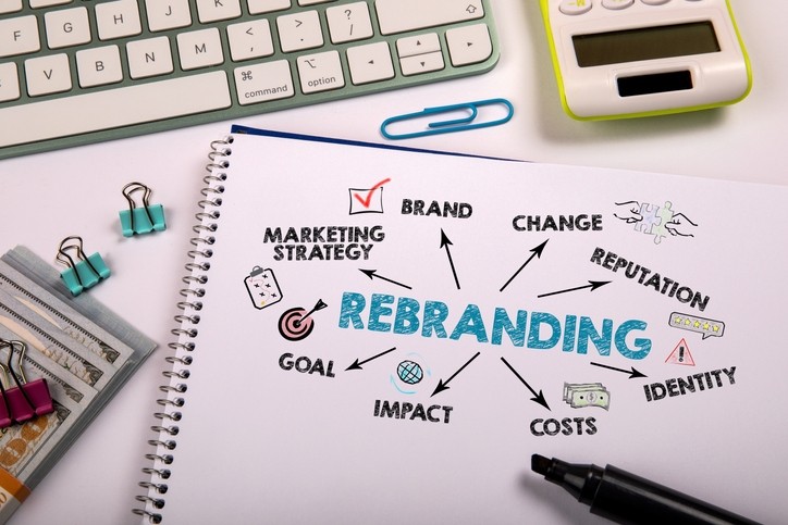
All three brands need to juggle the power of big name brand equity against the need to modernize and refresh and catch the attention of the next generation of consumers. How are they finding that balance?
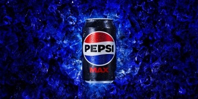
Pepsi: Keeping up with the times
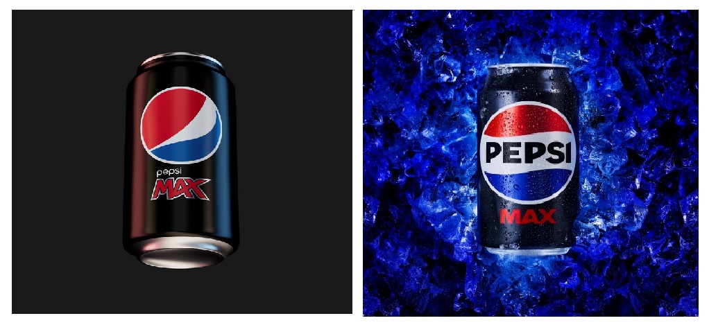
Pepsi unveiled a new logo and visual identity system in the US last year: which is now rolling out globally. The new design showcases a modern, custom typeface, a signature Pepsi ‘pulse’ and an updated color palette (featuring electric blue and black) to bring a contemporary edge to the classic Pepsi color scheme.
The rebrand represents the first overhaul of the logo in 14 years.
For Pepsi, the brand’s 125th anniversary last year was the perfect time for the rebrand: ‘connecting future generations with our brand’s heritage, marrying distinction from our history with contemporary elements to signal a bold vision of what’s to come’.
“Pepsi is a brand that’s on the world stage and interacts with millions of people every day so it’s important for us to revisit our look periodically to ensure we are resonating with fans in the places we show up,” explained Todd Kaplan, CMO - Pepsi at PepsiCo Beverages North America.
“While it’s not something we do all the time, we’re always pushing for reinvention when the timing is right to ensure we are continuing to innovate, staying timely and timeless – and last August was our moment, as brand Pepsi turned 125, which was a significant milestone for us.”
So far, consumers have loved the attractive color palette, distinctiveness and overall modern vibe, Kaplan told us.
Ocean Spray: revitalizing the juice category
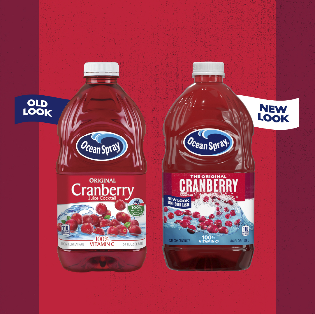
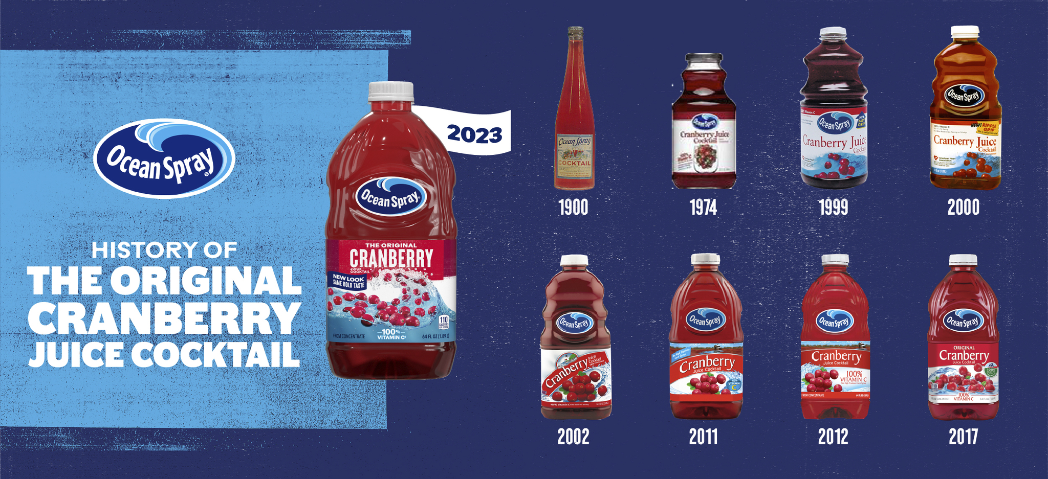
Earlier this month, cranberry icon Ocean Spray unveiled a new brand identity: marking the first significant brand changes is over two decades.
That includes updates across visuals: including the loco, illustrations, tone of voice, typography and photography.
For Ocean Spray, the decision to rebrand was more complex than a birthday celebration: with marketing teams seeing the need to address several challenges for the brand and category as a whole.
First of all was the need for the brand to connect with younger consumers: who don’t necessarily display the ‘incredible brand love and loyalty from those who grew up with us’.
“Our mission is to create multi-generational profit for our co-op owners; to do so, we must find new ways relevant to the next-generation juice drinkers,” said Eliza Sadler, Head of Brand Elevation for Ocean Spray.
Second was the need to re-dynamize the juice category as a whole.
“The shelf-stable juice aisle had not embraced meaningful change and modernization in quite some time,” continued Sadler. “So much so that it felt like a dusty shelf, with private labels easily co-opting the stagnant design codes of the category. As a category leader, we thought it was not just time but our duty to pave the way.”
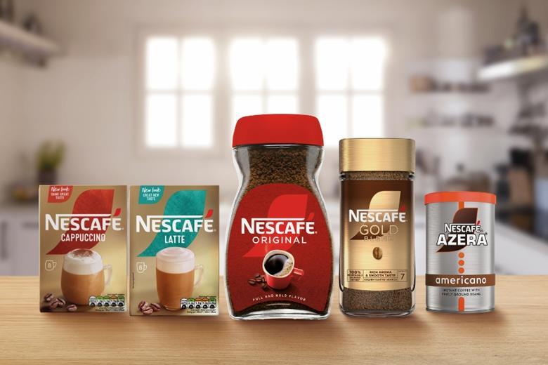
Nescafe 'major rebrand'
Nestlé's instant coffee Nescafe has unveiled a new look to modernize and 'resonate with coffee lovers in today's ever-changing coffee landscape'.
The global rebrand - which debuted in the UK last month - features 'modern, iconic and eye-catching pack designs' across the brand's Original, Gold Blend, Azera and Frothy Coffee ranges.
The brand places more emphasis on sustainability with the slogan '100% responsibly sourced coffee' on every pack.
But people don’t like change…
Are there any downsides to a rebrand? Yes, there are: consumers may be attached to a brand (and branding) they know and love. And there's the fundamental fact that- quite often - people simply don't like change.
That’s a point that Kaplan of Pepsi accepts: but also highlights the brand’s connection to popular culture requires keeping up with the times.
“Everyone embraces change differently but Pepsi has never been shy about reinventing itself to evolve with fans and move at the speed of culture,” he said. “The new logo and visual identity is one way that we’re bridging to the future. Our reinvention mindset is critical for a brand to remain timely and timeless all at all once, and it’s something Pepsi does very well. In fact, consumer testing and overall earned results generated a 100% positive/neutral sentiment once the new visual identity officially debuted.”
For Ocean Spray - a company that prides itself on its farmer co-operative roots and continued focus as a 700-farmer co-operative today - a re-brand is something that must be treated with particular care. It has kept some elements that hark to its heritage: as a homage to the co-ops roots, the brand opted for print-press-inspired typography and a more candid-style imagery of its grower-owners.
“Taking on the assignment of reimagining a 95-year-old brand is no easy task,” said Sadler. “You’ll always have consumers who love the old design for the nostalgic appeal and know that you can’t swing the pendulum too far or you lose consumer recognition and awareness.
"However, a refreshed approach inevitably helps bring into the fold new consumers who might have forgotten about us or not tried one of our products in years.”
Those points were at the heart of the rebrand: and is represented in the new design.
“We truly feel this rebrand toes the line between new and old, maintaining a balance and connection with our current users and those discovering us for the first time. Most of the original design elements are still at face value – water, fruit, our equity brand colors, etc. We reimagined these elements in a way that felt more iconic and breakthrough – celebrating our wave and the wildly uncommon grit that is our farmer mentality – leaning into spindrift, textured typography, etc. - to create a more modern and human look and feel.”
While the design stage takes time and care, the execution can be done speedily.
“While the work to get to this redesign took over two years, we’re now putting it into the market quickly and effectively via at-shelf and other integrated marketing touchpoints across social, PR, activations, and more. The first phase of our journey was our internal company rebrand, followed by some consumer touchpoints and new products. And now, we’re rolling out the new design across our entire portfolio.
“We aim to have the majority of the portfolio redesigned by the end of 2024.”