“Consumers have less time than they have ever had and there is just so much visual noise in life, in general, that even when people are grocery shopping they want to know what it is they are grabbing, put it in the cart and move on with their life. They just don’t have time for a deep dive,” Gael J. B. Orr, marketing-communications and PR manager for Once Again Nut Butter, told FoodNavigator-USA.
In response, she added, “brands throughout the grocery store are simplifying their labels and making it easier for consumers read messages and key information quickly.”
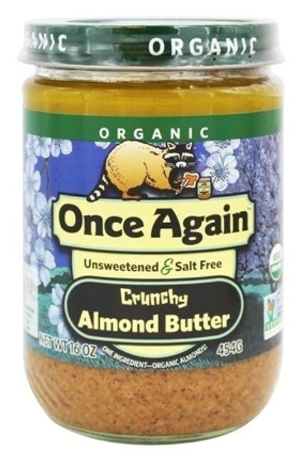
This includes Once Again Nut Butter, which for nearly 20 years featured the same “paintings” on its product labels, but is now overhauling the packaging.
“We held off for as long as possible with redesigning the labels because we loved the artistic look of the paintings on our old labels, but we also recognized that consumers needed a simpler, uncluttered label and so that is what we are doing,” Orr said.
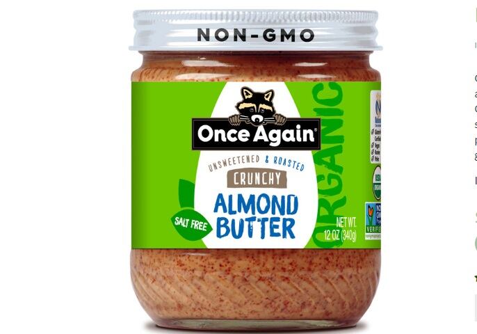
Among the many changes, company replaced the “paintings” that dominated the background of the brand’s labels with solid light green labels that feature front and center a white space in the shape of the butter’s key ingredient – either a peanut, almond, cashew, sunflower or pile of sesame seeds.
The white space of the ingredient made it easier to read the name of the product and key messaging, including whether the spread is lightly or unsweetened, creamy or crunchy and whether it is organic.
But simple doesn’t have to be boring, which is why the brand continues to use its iconic bold colors – even if it is just using them in a cleaner, easier to read way, Orr said.
She explained that the color of the text for the key ingredient is the same shade as the background of the old label, which was different for each variety. For example, the word ‘tahini’ is in bright purple, which is a carryover from when the tahini jar featured a painted purple mountain motif. Similarly, the old almond butter jar was predominately blue, so the word almond on the new label is in blue text.
“You can still have color and be easy to read. You don’t just have to go with a white label,” Orr said.
A new look from the top down
The company also streamlined the lids – moving from two colors to one. The old packaging featured either a brown or green lid depending on whether the spread was natural or certified organic. Now all the lids are white, which allows the company to more easily make clean claims on it, such as that the products are non-GMO. The switch also creates a better visual for brand blocking on shelf, Orr said.
Also on the top of the lid is a streamlined story about the brand’s raccoon mascot, said Orr. She explained that even though the story of how the raccoon came to represent the brand was always on the jars before, research showed that most consumers were not reading the blurb on the label. But now that it is on top of the lid – and shorter – the company hopes that consumers will read it and feel a connection through the mascot.
The raccoon also still sits on top of the company’s name on the front the package, but it is much smaller than the previous packaging – leaving the company plenty of space to call out that it is 100% employee owned.

Orr explained that this made the short-list of must-have call-outs for the revised label because it helps to communicate to consumers that they are buying products made by other people – not a faceless corporation
“When people buy our peanut or nut butters from us, they are buying small batch nut butter that is sort of artisan made, and made an in extremely high-quality, safe environment,” Orr explained. “It also helps convey how we are from a small town of 800 people, which means 10% of the town works for us and we are proud of who we are, where we come from and what we make.”
This message is reinforced on the label with call-outs that indicate who at the company thinks the jar the consumer is holding is their favorite flavor, she added.
Love on the horizon
While a brand refresh is a massive undertaking, the company is also developing a new line of Amore chocolate spreads that will rival Nutella, but be made with healthier ingredients while still being a treat, Orr said.
The brand already launched a chocolate hazelnut and a chocolate almond butter spread, which Orr says will change the way consumers think about a hot fudge sundae.
This spring it will expand with the launch of two white chocolate spreads – a hazelnut and an almond butter blend, she added.
“We know consumers will love them.”


